Well, that title is a lie : Obviously, a pointed nib is what you need to write a “pointed pen style” ? !…
All calligraphers spend a lot of time thinking about their nibs, especially when it comes to pointed pen calligraphy, as there are so many different nibs to choose from… But did you know that Copperplate has not always been written with a pointed flexible nib ? In fact, as the Round Hand evolved into a simpler form – more suitable for the quick pace of modern life – so did the pen used to write it. Let me tell you how we got from the broad cut quill to the pointed steel nib…
Different ways to cut a quill
As you may know, metal nibs only started being manufactured in the 1820’s. Before that, penmen had to use big birds’ feathers to make their quills. Not unlike today, some people preferred a stiffer nib, others liked a soft nib and the feather had to be chosen accordingly, but generally the second or third feathers of a goose wing were recommended. When cutting it into a usable pen, the final and most important part – forming the tip of the nib – varied according to the writing style for which it was being cut.
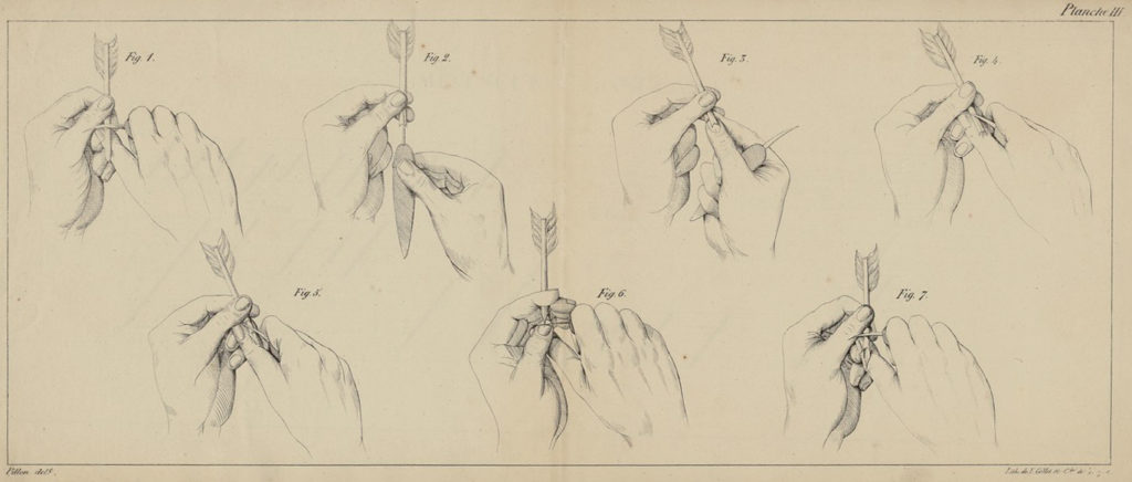
The English Round Hand1the “original” name of Copperplate appeared in copybooks between 1700 and 1710, it was heavily inspired by the “Italian Bastard” that had been popularized in France after the 1630’s. To write that hand, the nib recommended was not very flexible and a little narrower than the fullest stroke of the letter, with the left tine a little longer than the right, as we can see in the illustration below (middle).

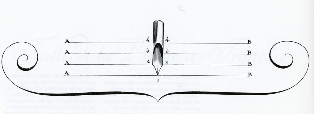
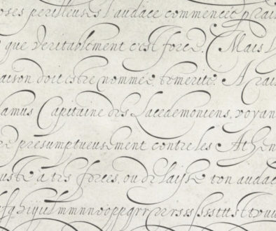
However, to write a faster (or “running”) version of the Bastard hand and to draw the “cadels” or flourishes, the French masters used what they called the “plume à traits”, which was as sharp and narrow as possible, and flexible. The longer the slit, the more flexible the nib : to write faster, the slit had to be shorter. When using this kind of pen, the shades were executed by exerting pressure on the “tines”, and the masters were used to changing the pen’s position quite a lot. However, cutting the quill to get a pointed end was not the easiest thing to do, and using such a pen required mastery of movement.
Notice on the next illustration that the sides of the nib leading to the point are not as curved as they are on the previous illustration. Indeed, to get the ink to flow evenly and a little faster, the sides of the tines have to hold more ink. This modification also makes the tip stronger. This shape wouldn’t be good for a slow, formal style – the result would be too messy – but it was ideal to draw spontaneous flourishes and to write fast…
The English Way
The English Masters who perfected the Round Hand were looking for a writing style that could be written fast but wouldn’t require pen manipulations like the French hands did. Some, like John Clark2 Writing Improv’d, 1714 chose to use the oblique “French” cut, others kept the broad nib, but changed the shape of the sides of the pen so that the ink would flow a bit faster.
In The Second Part of Natural Writing (1714), George Shelley – who was harshly criticized by John Clark – explained why he prefered his points to be square and not oblique : “The French make the right side somewhat shorter, but as we have altered and improved the hand, that pen is not proper for it”. He beautifully illustrated the different ways to cut a pen, each variation fitting a specific hand.

It seems that for the following decades, both the oblique and the square cuts were commonly used for the Round Hand3Joseph Champion (Junior), Penmanship or, the art of Fair Writing. A new Essay, London, c.1770. William Leekey, Discourse on the use of the pen, London, 1744. Charles Snell, The Standard Rules of the Round and Round Text Hands, London, 1715. George Shelley, The Second Part of Natural Writing, London, 1714. John Clark, Writing Improv’d or Penmanship made Easy, London, 1714.. To write the faster Running hand, masters recommended a narrower tip with slightly rounded corners and a short slit in order to avoid too much manipulation and “accidents”. As for flourishes and for the ornamental Italian Hand, the nib had to be the narrowest and “softer” – with a longer slit, like the French plume à traits I described earlier.
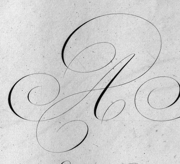
Naturally the Round Hand letterforms written using the broad quill looked a bit different than what we are used to producing with a pointed steel nib.
The position and shape of the thick stroke on the entry spiral is not the same, the shape and positions of the transitions between thick-thin-thick is different, the broad pen can produce secondary thick lines on upstrokes too (see left side of the spiral), which is not possible with the pointed pen. Another thing, which is not very apparent in my clumsy attempt at copying the master : a hairline produced with a sharp pointed nib is lighter than a hairline produced with the corner of a broad pen.
In all cases, the pen’s angle was fixed in the hand and the hairlines were written using the left corner of the nib. Ideally, the penman wrote without interruption, every stroke leading into the other, words being formed in one continuous movement. However, going from a thick stroke to a thin stroke required a subtle manipulation of the pen and masters of the art were better at it than regular people… which made the task of writing nicely somewhat frustrating for most people.
With broad pen, the breadth of the tip had to fit the desired breath of the thick strokes : penmen had to use a array of different pens in order to write at different sizes. As you can imagine, cutting and using many quills for different purposes wasn’t very practical for everyday use. And as the idea of special writings for special purposes slowly died out for the profit of a common hand used for all purposes, so did the habit of cutting many different quills : Penmen, including some professional masters, began to favor more flexible, polyvalent pens to write the Round Hand and the letterforms subtly changed.
The Transition to pointed and flexible pen
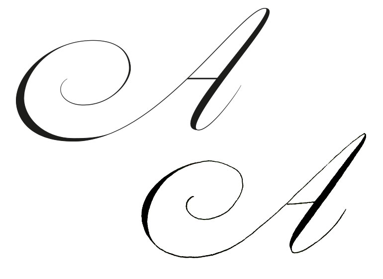
A pen cutter’s manual published in 17994John Wilkes, The Art of Making pens Scientifically, London, 1799 explains that more penmen then preferred to have just one or two flexible pens that allowed them to write in more than just one size. By applying more or less pressure to the tip of the pen, the thickness of the downstroke could be adjusted, but the thin upstroke could only be as thin as the tip of the nib. I believe that this change also affected Master Penmen, as some clues can be seen in late 1700’s copybooks, like in this A written by William Milns : the hairlines are thinner, the shades are placed higher… but there are still some subtle secondary shades on the right of curves, maybe due to the fact that the quill could never really be cut to a very fine point ?
By the 1820’s, using a pointed flexible pen seemed to be quite common. One master wrote “The nib has to be flexible to write in various sizes without changing the pen 5Pierre Picquet, Recueil d’Exemples variés d’écriture Anglaise, Paris, 1820”, another “A long split and a fine nib have nearly the same effect in writing as a short split and a broad nib 6James Henry Lewis, The Best Method of Pen-Making, illustrated by practical observations on the Art of Writing, London, 1820. The author of this book also invented a handwriting system derived from the Round Hand that later inspired Joseph Carstairs. ”.
Because such quills were more fragile and more finicky, they were the first to be replaced by metallic nibs. However, it took time to come up with the right design that replicated as much as possible the “action”7 a combination of the flexibility that allows to go from thin to thick, the spring back that allows to go from thick to thin, and the flexibility of the quill itself. See here of the quill and provided a more durable pen, but the industrial revolution eventually made that possible. By the 1820’s, English manufacturers had figured out a way to mass produce acceptable pointed steel pens that were considered easier for everyday use, a few decades later the production had reached impressive heights.
But the quill pen didn’t disappear overnight, it had its advantages : it was cheap, customizable – when you knew how to cut them properly -, it could be made very flexible or very stiff, and it held the ink longer than its steel replacement. Those who preferred to use broad pens kept using quills (broad nibs weren’t manufactured until around the 1850’s). By the middle of the century, the steel pen had become the modern writing tool by excellence.
I am still not sure when and if professional penmen who produced ornamental works (or calligraphers, even though they wouldn’t have called themselves that) made the change to the steel nib. But it seems that eventually, forgetting that the old pens used to be different and noticing so much difference between the engraved models and and their written copies, late 19th century scribes began to think that engravers had actually been responsible for the way 18th century copy-book letterforms looked like. Sadly, this misconception is still very present among calligraphers too… But I’ll come to this in my next post ;)
So, what does this mean for us, 21st century calligraphers ?
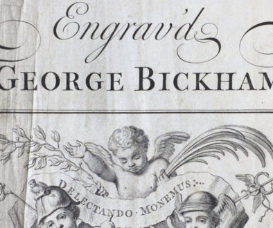
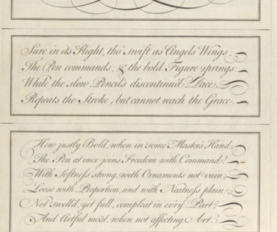
Some will say that attempting to write the classic Round Hand with a pointed flexible nib is historically inaccurate… In my opinion it doesn’t mean that it shouldn’t be done, as long as the tool you’re using gives you satisfaction. This just explains why the letterforms we write with a modern pointed steel nib can never look exactly like the ones engraved by Bickham in the Universal Penman… And probably why a style such as Engrosser’s script was developed. A quill, pen and paper manipulations and retouching – or a stylus as an ipad – may be necessary to copy the old model with more accuracy, but is calligraphy only valid when it’s about copying old letterforms ?
Remember that the English masters changed the way they cut their pen so that it would fit the hand that they wanted to write ? The original Round Hand shapes were not drastically different from the French or Italian shapes, but the choices that masters made about the pen they wanted to use made the hand evolve.
Here is my opinion : Use the tool that satisfies your own taste, and play with old letterforms even though you know you can never reproduce them perfectly : they will teach you a lot about movement, proportion and balance but give you the freedom to create something original that you will be able to truly call yours.


I’ve always wondered how they got the shades to fall that way and in those places. Thanks for the explanation. Is there a calligrapher out there doing roundhand with this cut nib or getting the same classic look with a pointed pen retouched meticulously?
I don’t know if anyone is using the classic tool, I tried but failed miserably ! Cutting the quill is one thing, there are plenty of descriptions in copybooks but each penman had his own preferences which gave slight differences in the writing itself… But I have a hard time understanding every single step of the process properly, at least that’s what I’m telling myself. I know Paul Antonio cuts quills and probably tried the classic look, but I haven’t seen him write with the “classic tool”. Actually he’s the one who brought my attention to this. There is also… Read more »
Thanks for replying. We need to bring this back! It’s just not the same with modern nibs ????
Given how you’re so talented at picking up new crafts, I could send you all the descriptions of nib cutting that I have and you could try ;D ! Like Andrew says below, quills had their downsides too, the first one being that it’s not easy to cut them properly…
I’m too lazy haha. Surely we have the technology now to manufacture long-lasting “quills”. Problem is there’s no market for this kind of stuff ????
So are the shades produced by pressure as well or manipulation? Don’t say ‘both’ coz that would be too hard to execute & I’d like to keep thinking this is doable ????
Well, you’re not going to like the answer then… I think both… quills are more flexible than steel, so my guess is that they could use a bit of pressure to add a little more width to their shades. This would explain why we can’t really get the same kind of shades with a steel broad nib either ? But, I know some penmen preferred softer quills (mainly the ones who did more flourished designs), and others used a stiffer tool… Contrary to what is often said, the RH wasn’t meant to be a uniform style : personalization was admitted,… Read more »
That’s what I thought too. It’s got to be a combination. Which makes writing like that even harder. Almost seems like they alter the hand position mid writing in some areas to achieve certain shades. If only they had video recordings ????
Even back in the day of quills, very few people were skilled at cutting and mending them. As steel pens became more common, one constant refrain in their favor was how much everyone hated mending pens, and how practically no one was really skilled at it. And people went through a lot of them. I have a document that discusses the use of quills, patent and steel pens by the Bank of England in the 19th-century. The BoE kept meticulous records of supplies ordered and used (as you would expect of bankers), so there are tons of statistics. They mark… Read more »
Yes ! cutting quills was not something everyone was able to do. The job of professional pen maker (quill cutter) probably didn’t last more than a century… Before the 18th century very few people learned how to write, and when they did, the master first taught them how to cut and mend the quill. When writing instruction became more common (during the 18th century, not sure about dates here), the demand for pre-cut quills probably took off… until the disposable nibs took over. I know that they used different types of feathers according to the kind of pen people liked… Read more »