The Italian hand is the oldest of what we call the “pointed pen styles”. If you’ve seen it, maybe in one of Heather Victoria Held’s beautiful compositions, you’ve probably found it a little strange but full of charms.
Did you know that it originated in Italy around the 1560’s, back when they didn’t have any steel nibs and when copybooks weren’t even printed from copper plates ! This is actually the grandmother of the English Round Hand (his grandfather is the French “Batarde Italienne” and his parent is kind of a hermaphrodite – I know I have a strange way of thinking !).
Because of its very long history, it has changed quite a lot over time. And since this is a real cursive handwriting style meant to be written without pen lifts, all the penmen who used it were able to personalize it and make it their own. I’ve already shared what I know of the history of this style in a previous post, so today I’m going to share with you my favorite digitized resources on the subject.
1. Italian books from the late 16th century and early 17th century
The Italian hand was first published in Italy by a penman called Francesco Cresci. At the time this new style was seen as scandalous by other penmen, but it nonetheless became the most popular handwriting style in Europe for two centuries.
You will see some really nice close-up views of the hand in SCALZINI (Marcello), Il Secretario…, 1587.
I also like these two :
CURIONE (Ludovico), La notomia delle cancellaresche corsiue, & altre maniere di lettere, 1588. and this manuscript : CURIONE (Ludovico), Folder with loose pages, with no title page…, 1593.
SEMPRONIO LANCIONE, Forma del bene… scrivere, c.1610.
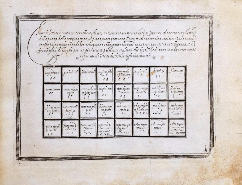
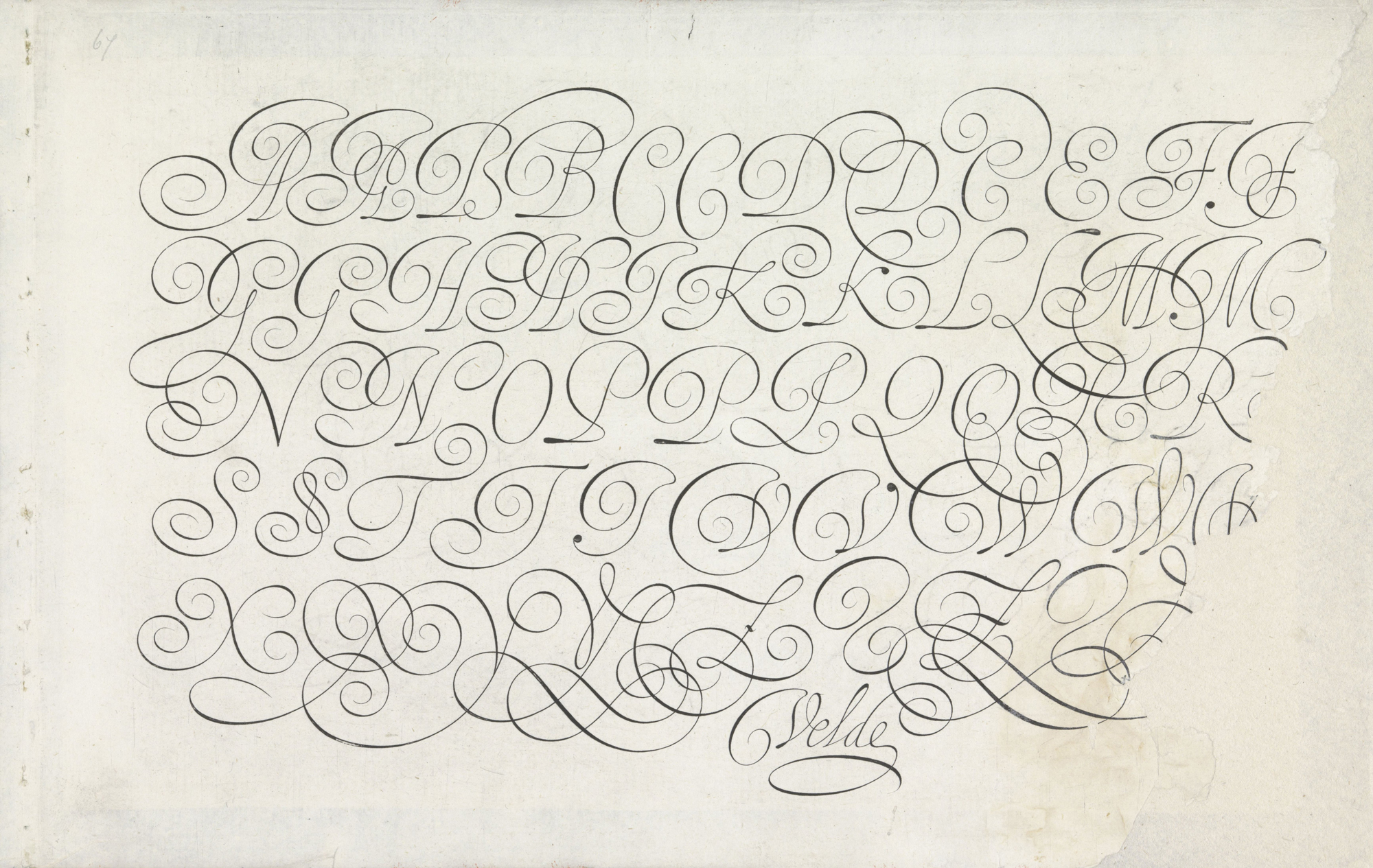
2. VAN DE VELDE (Jan), Spieghel der Schijfkonste, 1605.
Jan Van de Velde is undeniably the most famous of Dutch penmen, and of course an incredibly talented calligrapher. This is his masterpiece and around half of its plates are dedicated to the italian hand. Velde’s style was very expressive and it had a huge influence throughout Europe, and English Writing Masters of the 18th century were still under the charm of his compositions and competing to show their own talent was as good as his…
If you follow the link above, you will get to the Rijksmuseum where they show some original manuscript pages next to the engraved pages, sadly the album doesn’t contain all the plates of the book. You can see a full copy here.
3. MATEROT (Lucas), Les œuvres de Lucas Materot…, 1608.
Lucas Materot was a vey talented master penman in the papal chancery in Avignon. This book, beautifully engraved, is essentially dedicated to the italian hand. Materot’s style was closer to the original italian master’s hand than that of the Dutch masters (like Velde or Maria Strick). Two plates are especially interesting to me in this book : here and here, you can see two full pages of lowercase variations and ligatures.
4. STRICK (Maria), Schat oft voorbeelt ende verhooninge van verscheijden, geschriften ten dienste vande…, 1618.
Maria Strick is one of very few women I encountered in my research through the history of post-Renaissance calligraphy. But being a woman isn’t the only reason why she’s in this list… I have to say I love all of the early 17th century Dutch penmen’s italian hands (go have a look at them in the bibliography), but Maria Strick did actually participate in a calligraphy contest where her writing was so praised that she won 2nd place with a special mention from the judges who said her Italian hand was the best they’d seen. This wasn’t to the liking of the actual winner though…
5. BILLINGSLEY (Martin), The Pen’s Excellencie or the secretaries delighte, 1618.
This is one of the first english copybooks containing plates of engraved models. Billingsley’s Italian hand looks really good in my opinion, it is a bit more loose than the Italian master’s or Materot’s, but more attainable than Velde’s. On the second image, you can see a beautiful manuscript sample.
6. COCKER (Edward), The pen’s transcendencie…, 1657.
Cocker is often described as one of the greatest penman in 17th century England, he most certainly was the most prolific author of copybooks (17 copybooks are accounted for today). He was just 26 when he wrote and engraved this third publication. All of his books are populated with lavish off-hand flourishes. The fashionable Italian hand occupies a good place in this book, but all the other traditional english hands are not overlooked.
Here are some other titles of his :
COCKER (Edward), Arts glory, or the Penman’s treasury, 1657.
COCKER (Edward), The pen’s triumph, 1658.
COCKER (Edward), Magnum in Parvo ; or, the Pens Perfection…, 1672.
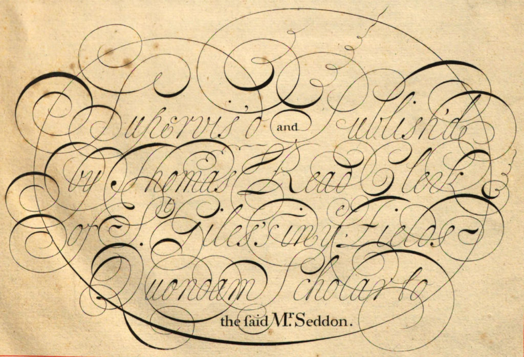
7. SEDDON (John), Penman’s Paradise, 1695.
Little is known about John Seddon’s life, except that he died in 1700. He excelled in the “ornamental” part of writing and adorned the pages of this copybook with lots of examples of “command of hand” (flourishes), that would later appear in other penmen’s works. In this book, you will see six beautiful plates of Italian hand, one of which is of very intricate capital letters (n°19 and following).
8. AYRES (John), Tutor to penmanship, 1698.
John Ayres was a major Writing Master from the end of the 17th century, and his work was really important for the development of the English Round hand. In this book, you will see some examples af delicate italian hand as well as some really boldly shaded experiments. Heather Held mentioned that this is where she found most of the inspiration for her style of Italian hand.
9. SHELLEY (George) & SEDDON (John), The Penman’s Magazine, 1705.
George Shelley is one of the masters I admire the most. His style is really unique and playful, and his books contain a million variations of capitals and flourishes… This book is a little strange, as it is a combination of Shelley’s writing and illustrations made by the late Seddon, who had died a few years prior. The italian hand in these pages is absolutely gorgeous, really delicate and airy, yet very ornate…
This other book by Shelley is also worth looking at.
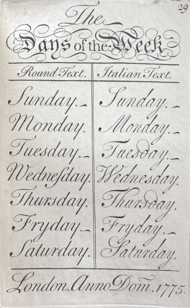
10. ANON, The Young clerk’s assistant, or penmanship made easy…, 1733.
This is a small book that was engraved by George Bickham who probably penned the models of Round Hand and Italian Hand. Here, the Italian hand is really stripped of all its artifices and made as simple as possible. The author also shows that you can use Italian lowercase with Round Hand capitals and the reult is really nice.
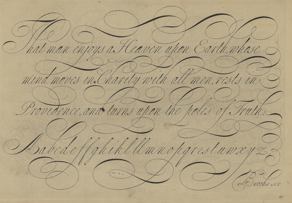
As the 18th century unfolded, the Italian kept a small place in copybooks, essentially used to bring some variety to pages filled with the Round Hand. This is a hand that was especially recommended for Ladies, as penmen said it was easier to learn and required less muscle. You will see it in the Universal Penman, and works by Joseph Champion… But I would like to end this list with these two beautiful books published in the late 18th century, where you will spot some nice examples of the Italian hand as well.
TOMKINS (Thomas), The beauties of Writing, 1777.
MILNS (William), The Penman’s Repository, 1795.
I think I may have listed too many books in this post, but I hope this will help you in your studies. Tell me if you know of any other book that would fit in there !


Thanks so much for this post. I stumbled the Italian Hand and was wondering how the style changed from Velde to Heather Held. I find the script quite informal and even though it very old, the informality seems modern somehow.
Thanks for the comment and appreciation ! Yes, I agree with you that Italian hand somehow has some modern aspects to it. The hand did evolve quite a lot over time because its “rules” are a bit looser than those of the later English Round Hand… As it can be a very cursive style (all letters are attached to one another) there are lots of possibilities for personalization. Velde’s style was typical of Dutch early 17th century and Heather’s style is more inspired by English masters, mostly of the late 17th and early 18th century. In my opinion, modern calligrapy… Read more »
Hello. Thanks for sharing all this information. The book from Lucas Materot from the link is not complete. There is a copy in archive.org that shows a page between pages 23 and 25 with lots of minuscules. I am amazed by this script and I am going to start studying it.
Hi Dina,
Thank you for your comment. Yes, there sometimes are other versions of these books online, and I try to choose the one that offers the best quality of images. Thank you for bringing this one to my attention. In comparison, the link I provide has 3 pages that are not in the archive.org copy, but there’s this page you mention that is missing. All of the surviving copies of these books have these kinds of differences. I will add the archive.org link.
Thanks. You are amazing for sharing these books.