Kate and Cecilia of the EU pointed pen collective had the kindness of inviting me to a live IG chat yesterday, to ask me questions about Penna Volans and, most of all, to let me share how I go about studying the capital variations you can find in my catalogs… This is something I had been meaning to do for a long time, so why not put it all in writing here for everyone to see ;)
1. Know what you want to achieve
In my opinion, knowing what you want to gain from studying historical exemplars might be even more crucial than the time you will dedicate to your study. Your expectations and results might greatly differ from someone else’s, depending on what you want to be learning, and that is totally ok. But know that you will need to be realistic : if you are just barely comfortable with the basic iterations of a letter, try and master the easier variations first (ie. the less flourished letters), then you will gradually learn to extend your strokes and grow beautiful flourishes out of the basic letterforms.
Your practice will be different if :
– You are just starting calligraphy and began learning basic capitals : keep on studying the basics in priority and work on your technique. Be very precise in your observation of the exemplars as it will allow you to build a good mental image of what you want to achieve. Knowing what you want to execute is primordial. Also be very critical of your strokes and always aim to perfect one thing at a time. Don’t get too impatient, you will undoubtedly get better faster if you manage to stay focused in your study.

– You are an “informed” beginner and you want to explore new avenues : choose to work on basic variations first. There are always a few different ways to make a simple letter and the catalogues contain more examples of less flourished specimens than of very flourished ones.
Learn to see what makes the example beautiful and balanced and try to work on one thing at a time (work on the stem for example, or on perfecting a curve…). Work primarily on understanding the rules of flourishing through applying those rules. Tracing the exemplar might help you get a sense of the amplitude of the movements you need to make. But in the beginning there is a lot to keep in mind, so be kind with yourself if you don’t succeed in making a satisfactory copy, don’t decide that you hate that letter or that it isn’t right for you, don’t close that door. You probably missed some details that you will see in a later study session, but you also certainly learned something that you will be able to use in your practice. Just like a flourish grows from a basic letterform, the ability to make them will slowly grow from your complete understanding of the rules.
– You are more advanced and comfortable with the basic forms of a capital and you want to start learning how to make fancier variations ; or you want to start exploring how to add flourishes in your designs : depending on what appeals to you, I would advise that you try multiple variations in a casual way. Observe the exemplars, take notice of the details that you might want to try and use them on the letter you feel comfortable with. You don’t need to be extremely precise, but you need to be critical of your own work. This kind of study is really fun, and often leads to new discoveries that will make you really proud of the progress you’re making.
– You are studying a letter that you would like to use in a specific project : then be very precise in your study. Try to observe all the details and do your best to get the same kind of balance you can see in the exemplar. This kind of study is always fascinating as you slowly learn to correct your movements, but it can take a lot of time and focus.
2. Train your eyes
In copperplate as in Spencerian penmanship and other scripts, the repetition of shape (ovals), of spacing (white space), of slant… Is really important. Take notice of all these things and try to replicate that in your practice.
In order to make the best out of your study time, learn to look at the exemplars with eagle eyes.
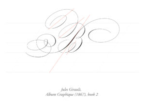
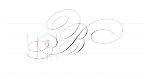
– Use the guidelines to help with correct placement of strokes : almost all the letters in the catalogues were placed on typical guidelines for copperplate, with 55° slant lines (you can build your own guidelines here). In the example here, the stem (or curve of universal beauty) is on the 55° slant. Notice that the stem touches the 55° slant only in the middle third of the letter, and the stroke is thickest when on the slant. The loop at the bottom right is also on slant, but the two top left loops are not.
Notice where the strokes start and end, relative to the horizontal guidelines.
The crucial thing here is that the small middle loop is right in the middle of the letter, and the back loop is going down at approximately the same height as the middle loop.
Look for all the other placement details that may be relevant so that when you are executing the letter you know where you want your pen to land. Here, I noticed that the flourish that ends the stem stroke is made of strokes that are very regularly spaced.
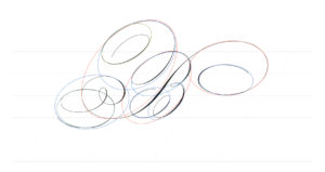
– Look for the underlying ovals
Copperplate capitals and flourishes are built around oval shapes. Take notice of these ovals and their slant. Some are horizontal (or almost there), some are on a 55° slant… Be careful not to create a letter were all ovals are going in different directions. This example has ovals going in 3 different directions, I wouldn’t attempt to make anything as complex without an exemplar to show me how to keep everything balanced.
If you are frustrated with the quality of your strokes, do oval drills as often as possible. I do them on the 55° slant and on an horizontal slant, and I do them as big as possible (3cm high minimum), with whole arm movement.
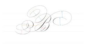
– Be aware of the white space between stokes
In flourished variations, be mindful of the balance of white space between the stokes : similar spaces are illustrated in the same colors here.
– Notice the contrast and placement of thick and thin :
Depending on when the exemplar letter was penned, you will see different kinds of contrast and shade placement. In this letter, notice that the stroke is thickest on the stem (curve of universal beauty). The thicks on the bowls of the B are coming in second place, then the thicks on the external parts of the flourishes on the stem. The two thicks on the top left loops are more subtle, the first one being lighter than the second one. The slant of those shades is also very important, they are mostly parallel to one another.
Bear in mind that penmen didn’t use pointed steel nibs before the 1840’s, and even after that, most masters still prefered to cut their own quills in their own favorite way. Until approximately the 1790’s, broad cut quills were the rule, but towards the end the 18th century, the nibs were getting pointier : this can be seen in the thinner hairlines and in the transitions between thick and thin in turns (the thick doesn’t go down as low as it used to). This means that, because you are using a different tool, when you study specimens from before 1840, you have to expect different results. For example, a pointed steel nib will not be able to make a small shade on an upstroke, if you want a shade there, you will have to touch up your letter or adjust the ductus (break up the letter into smaller parts that go in different directions).
– Keep the letter and word balanced :
Here, the top right flourish is balanced by the bottom left flourish, and the top left loops are balanced by the bottom loop and the additional flourish (in grey). If you make one of those elements smaller or bigger, know that you will need to work on balancing your design by modifying some other part.
For example, if the word I want to write after this letter contains an ascender in the first letters, I will have to modify the top right spiral. With the ascender I will have to fill the available white space in a way that balances the bottom left flourish. And if there is a descender in the word, I could get rid of the additional flourish in grey and use that to better balance my design.
Moreover, I will need to find a way to balance that very prominent capital letter at the end of the word or sentence. If the capital is top heavy, work on flourishing the bottom and side of the end of your line.
Working with flourishes can be very tricky because of this very aspect : the more you add flourishes in one place, the more you will need to balance that in another place.
3. Train your hand
As I have written earlier, training your hand to make nice ovals is really one of the most helpful things you can do.
When I practice using an exemplar, I always first focus on the movement aspect of things before I start to self-criticize the letter itself. I personally love writing B’s because it’s a cascade of ovals going one into the other, I always want to keep going !
When I’m starting to get into the groove, I begin to look at my strokes more closely and start to modify my movement according to what I need to change to follow the model.
Movement is really important for me, so it comes first when I practice, but I know some others will be more focused on other things like form or technique. Just know what is important to you and work on one thing at a time.
4. Learn to see your mistakes, and strive to correct them
If you have seen all the details I listed above, you should be able to see where your strokes are going astray. Gradually try and modify your movements so that the letterform starts to look more like the model. I am not the kind to obsess over the smallest details : once I get a letter that seems close enough for my own taste, I keep practicing it until I could make it with my eyes closed. The important thing for me is that after I learn to make the letter properly, I really make it my own : this way I know that the strokes will come naturally when I will need to make them.
5. Don’t get too distracted
Focused practice is without a doubt the best way to improve your skills. Whether you are aiming to copy an exemplar or you are just casually practicing the things you already know, stay focused. It is very tempting to get bored before you have really made any real progress. That’s probably ok… But it’s not the best way to achieve real progress.
Don’t get me wrong, exploration is also really important, but when you’ve decided to learn something, don’t get too distracted if you want to be successful.
6. Be creative
One of the things I like most about the catalogues I build is that they not only show you what has been done by previous masters of calligraphy, they show how you can mix and match flourishes, or add simple modifications to build new variations. Take some time to explore the different things you see in exemplars and use them with the things you already master. This is how you will learn what appeals to you, and how you will slowly develop your own style.
That’s all I had in mind for now, I hope this helps ! If you’ve got questions, just comment below.
Take care of yourselves and enjoy the practice ;)
PS. If you missed the live, you can see it here !


